Components
Easing Animation
This component allows you to animate controls within your Power Apps applications. The component provides 30 different animations that you can apply to your controls.
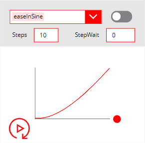
Link to download the small app containing the component: Download here.
Bubble Helper
This component will help you chain help bubbles within your canvas Power Apps applications to help your users understand how the screens of your apps work. The main BubbleHelper component comes with a BubbleSteps component where you will be able to configure the steps your bubbles will go through. Both these components are provided within a small app that will teach you how to set them up inside your own apps.
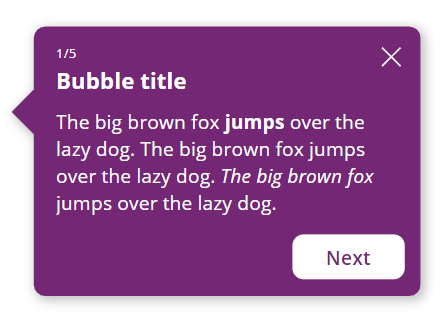
Link to download the small app containing the 2 components: Download here.
Power Spinner
This component allows you to add custom spinners to your Power Apps applications. You will also find an application that lets you play with the various spinners and get the code to place in an image control in your app.
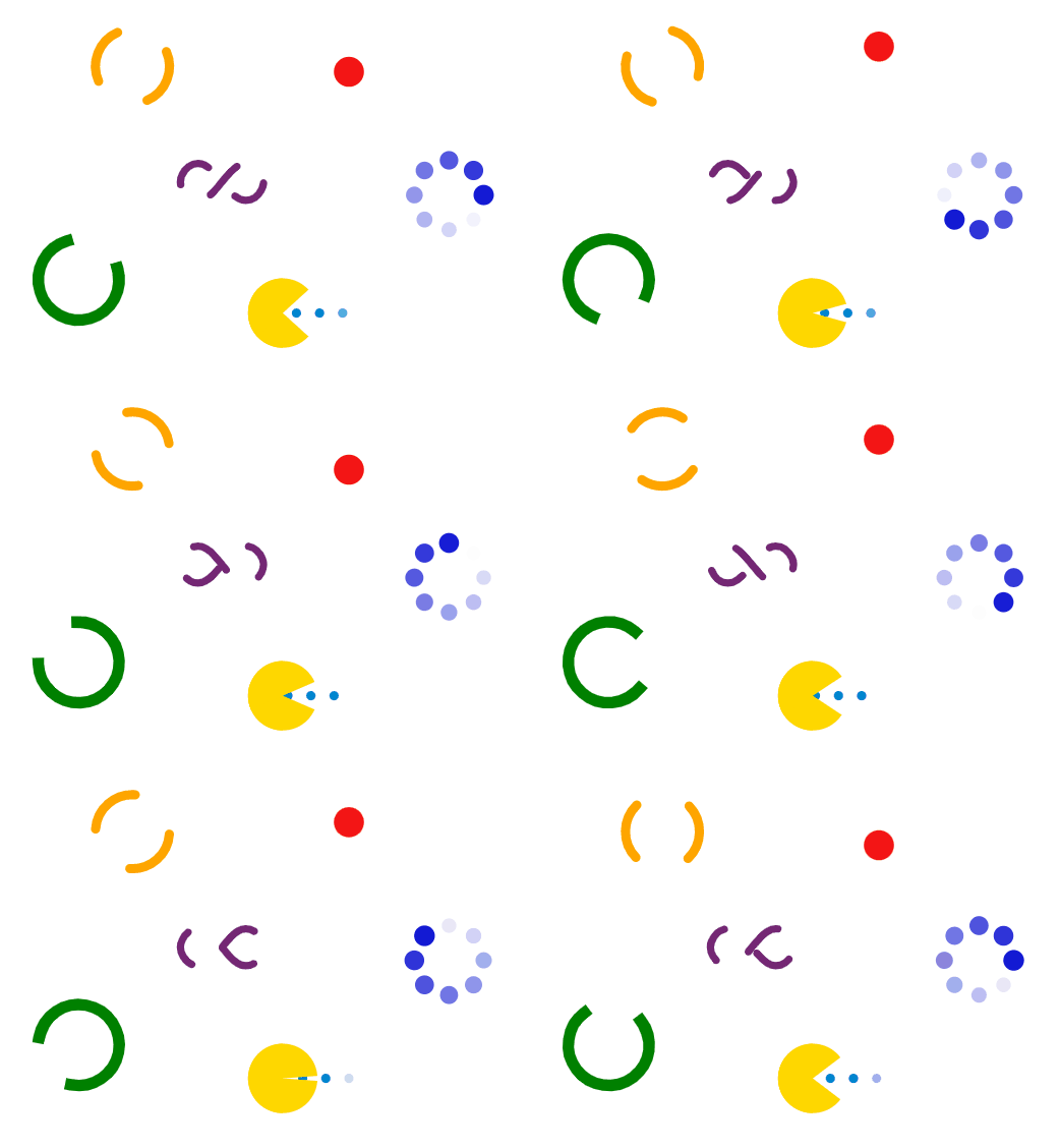
Link to download the component MSAPP file: Download here.
Link to download the application MSAPP file: Download here.
Form Factor Selector
This component allows you to change your app’s screen form factor within the Power Apps Studio.
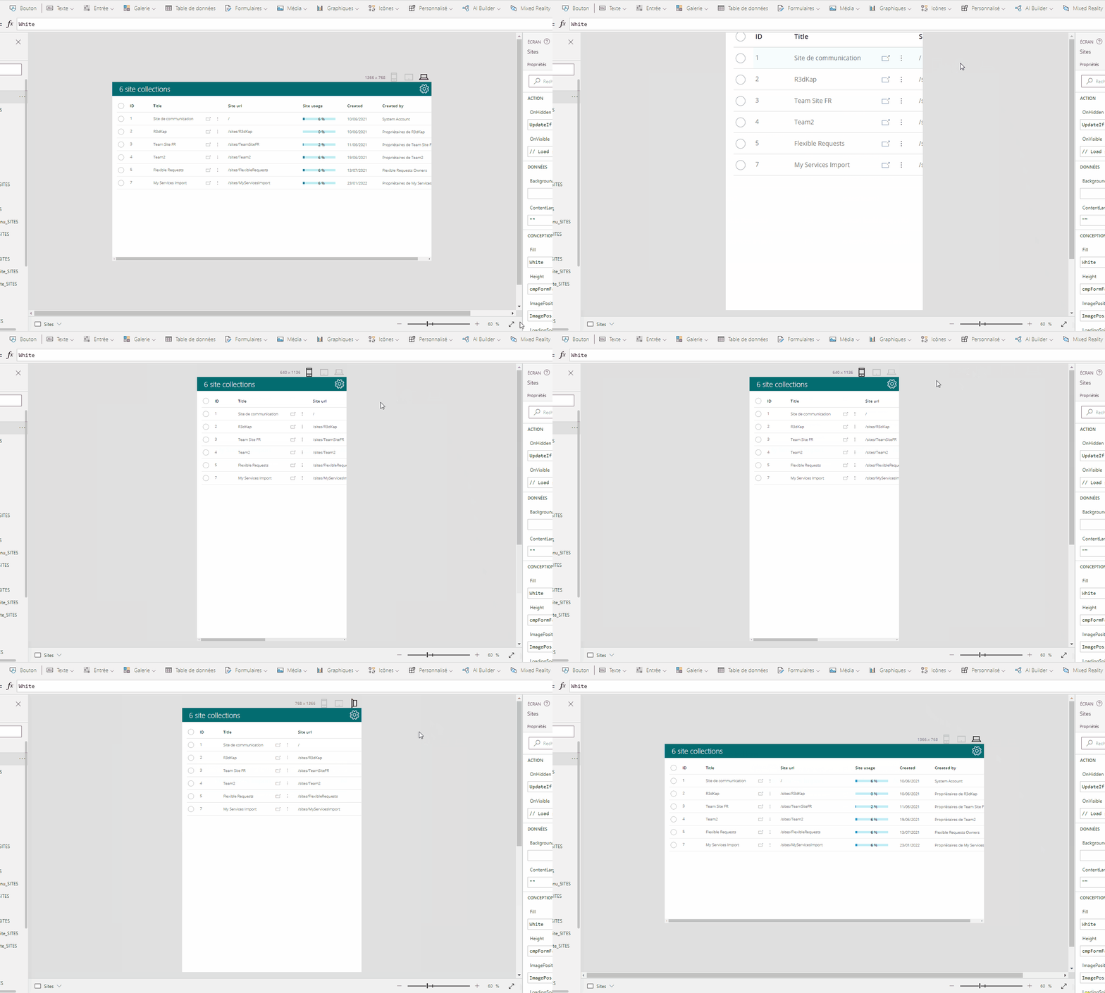
Link to download the component MSAPP file: Download here.
Progress Bar
This component is a fully customizable progress bar.
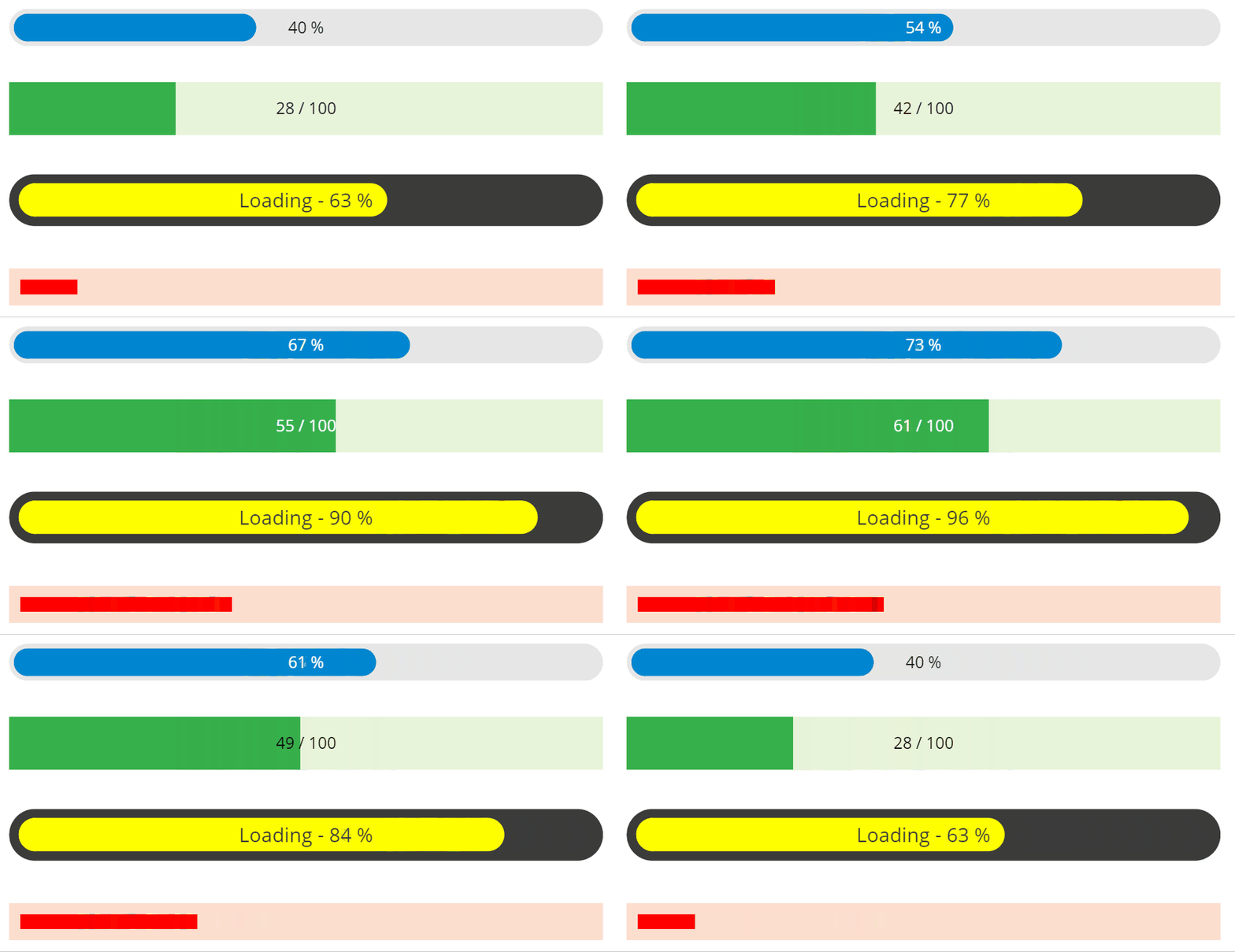
Link to download the component MSAPP file: Download here.
IBAN Checker
This component will allow you to check if an IBAN number is correct.
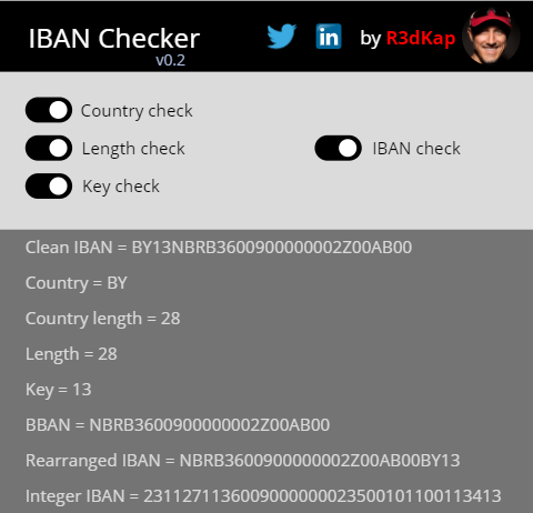
Link to download the component MSAPP file: Download here.
Control Animator
This component will allow you to animate your controls within your Power Apps canvas applications.
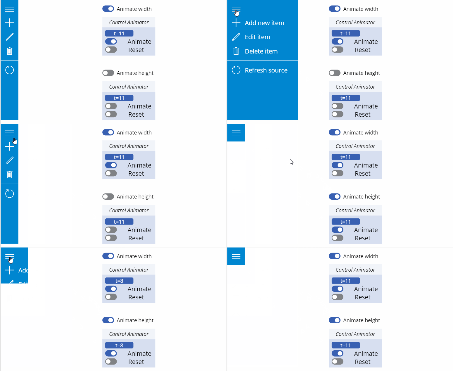
Link to download the component MSAPP file: Download here.
Auto Width Label Generator
This component will provide you with a solution to make your Power Apps label controls adapt their width to their content.
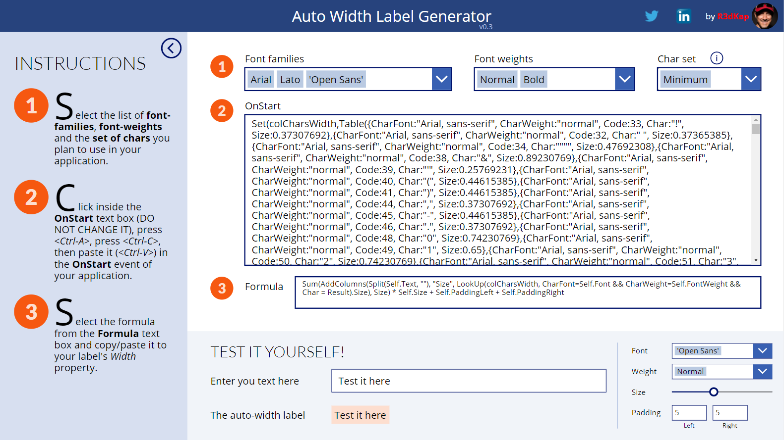
Link to download the component MSAPP file: Download here.
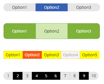
Toggle Set
This component lets you create and customize a set of items that can be toggled:
Link to download the component MSAPP file: Download here.
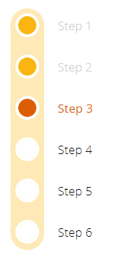
Metro Vertical Progress Bar
This component is a fully customizable progress bar with a metro/stations like look:
Link to download the component MSAPP file: Download here.
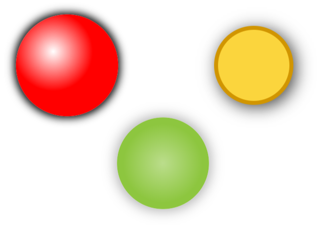
Shadow Circle
This component allows you to create a circle with its configurable drop shadow, inner solid or gradient color fill:
Link to download the component MSAPP file: Download here.
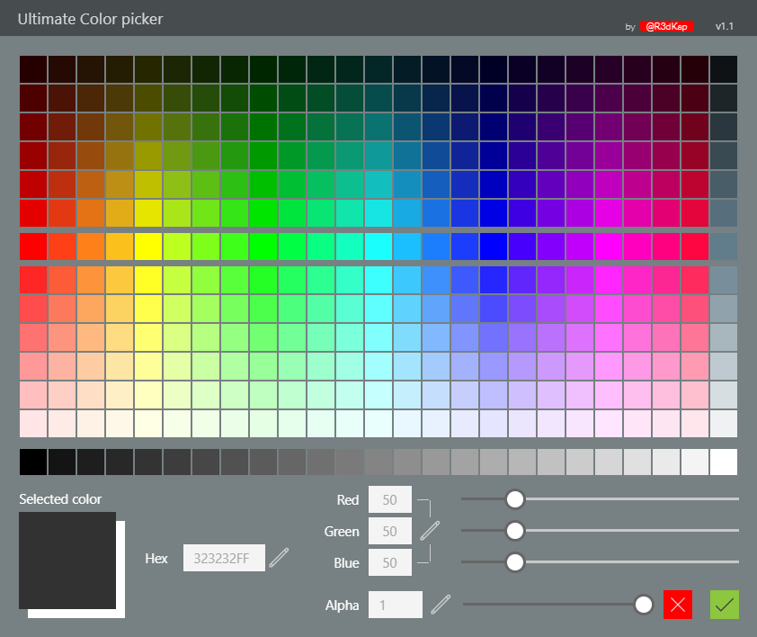
Ultimate Color Picker
This highly customizable color picker will show a wide range of palette colors based on main colors (middle row) you provide.
Link to download the component MSAPP file: Download here.
Office UI Fabric Icon Generator
This component allows one to generate the SVG code for an icon picked among the whole list of the Office UI Fabric Icons (which can be found here). This SVG code can then be used in an Image control in any Power Apps application.
![]()
Link to download the component MSAPP file: Download here.
Shadow Box
This component shows a [rounded] rectangle with a configurable drop shadow and colouring:
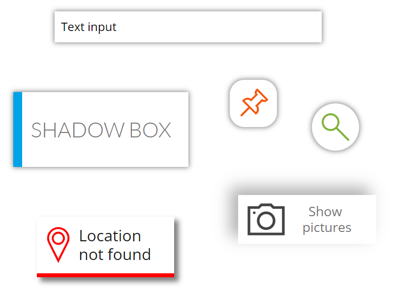
Click here for details and other nice examples.
Link to download the component MSAPP file: Download here.
Circle Progress Bar
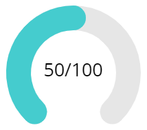
This component is a configurable circle progress bar:
Link to download the component MSAPP file: Download here.