ShadowBox component
This component shows a rectangle with a configurable drop shadow and colouring edge.
Notes
Align the shadow with your controls (v1.1)
Use the MarginLeft, MarginRight, MarginTop and MarginBottom output parameters to fit your shadow easily to your desired control. For instance, let’s say you have a control called cmpColorPicker to which you’d like to apply a shadow:
- Add the component to your screen, name it cmpMyShadowBox and set its position and size as follow:
  o cmpMyShadowBox.X = cmpColorPicker.X - cmpMyShadowBox.MarginLeft
  o cmpMyShadowBox.Y = cmpColorPicker.Y - cmpMyShadowBox.MarginTop
  o cmpMyShadowBox.Width = cmpColorPicker.Width + cmpMyShadowBox.MarginLeft + cmpMyShadowBox.MarginRight
  o cmpMyShadowBox.Height = cmpColorPicker.Height + cmpMyShadowBox.MarginTop + cmpMyShadowBox.MarginBottom
Setting the edge position (v2.0)
Let’s say you’ve added the component in your app and that you’ve named it cmpMyShadowBox. To set its edge position, simply set its Position option inside its Edge input parameter like this:
cmpMyShadowBox.Edge.Position = cmpMyShadowBox.EdgePositionEnum.LeftMaking a full circle shadow (v2.0)
Setting the Radius option from the Box input property to a large value (actually greater than half the height of the box) will allow you to produce a full-circle shadow (assuming your box is square). For instance, it can be done this way:
o cmpMyShadowBox.Width = Self.Height o cmpMyShadowBox.Box.Radius = Self.HeightIMPORTANT: when rouding the corners of the box, the edge cannot be displayed. The edge can be visible only if Box.Radius = 0.
Properties
Here are the properties available to configure the box:
Input
- Shadow (record) = set of parameters defining the shadow’s look
- OffsetX (number) = horizontal position of the shadow (positive: to the right; negative: to the left)
- OffsetY (number) = vertical position of the shadow (positive: to the bottom; negative: to the top)
- Color (text) = color for the shadow (color can be: color name, #rrggbb or rgb(rr,gg,bb))
- Blur (number) = integer value to specify how much the shadow should be blurred
- Opacity (number) = value between 0 and 1 to specify the shadow opacity (0 is transparent, 1 is opaque)
- Box (record) = set of parameters defining the box’s look
- Fill (text) = fill color for the inner box (color can be: color name, #rrggbb or rgb(rr,gg,bb))
- Opacity (number) = value between 0 and 1 to specify the inner box fill color opacity (0 is transparent, 1 is opaque)
- BorderThickness (number) = width value for the inner box border (in pixels)
- BorderColor (text) = color for the inner box border (color can be: color name, #rrggbb or rgb(rr,gg,bb))
- Radius (number) = radius (in pixels) to round the box’s corners
- Edge (record) = set of parameters defining the edge’s look
- Position (text) = position of the colouring edge (to be defined using the EdgePositionEnum output parameter of the component)
- Width (number) = width of the colouring edge (in pixels)
- Color (text) = color for the colouring edge (color can be: color name, #rrggbb or rgb(rr,gg,bb))
- Padding (number) = padding between the inner box border and the colouring edge (in pixels)
- ShowEdge (boolean) = displays a colouring edge inside the box
Output
- MarginLeft (number) = distance between the left border of the component and the left border of the inner box
- MarginRight (number) = distance between the right border of the component and the right border of the inner box
- MarginTop (number) = distance between the top border of the component and the top border of the inner box
- MarginBottom (number) = distance between the bottom border of the component and the bottom border of the inner box
- EdgePositionEnum (record) = enumeration of the various edge positions allowed: left, top, right, bottom
Examples
Drop shadow placed behind a text input box:
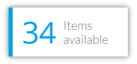
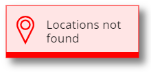
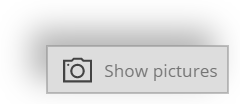
Nice visual cards where some text and icon controls have been placed in front of the shadow box:
Shadows for buttons:

Playing with the Radius option of the Box parameter, you can easily produce a perfect circle shadow:

HISTORY changes
v1.0 [ 10-oct-2019 ]
- Initial publish
v1.1 [ 01-dec-2019 ]
- Added margins output parameters
v2.0 [ 20-sep-2021 ]
- Regrouping of input parameters
- Added rounded corner radius
- Added enumeration for edge positionning