MetroVerticalProgressBar component
This component is a configurable metro-like progress bar. Each step is like a metro station… :P
Component properties
Here are the properties available to configure the progress bar:
Input
- Items (table) = list of steps (each step has an id, a label and a visibility boolean)
- Colors (record) = the colors for the bar background, circles, labels, in each state (ToDo, Active, Done) and for the step circles border
- BarWidth (number) = in pixels, the width for the background bar
- BarInnerMargin (number) = in pixels, the inner margin between the bar and the steps circles
- BarAutoHeight (boolean) = if True, adjusts the height of the background bar to the visible steps, otherwise it has the same height as the component’s
- CirclePadding (number) = in pixels, the padding between the steps circles
- CircleBorderThickness (number) = in pixels, the border thickness for the step circles
- Size (number) = font size for the steps labels
- LabelPaddingLeft (number) = in pixels, the left padding for the steps labels
- ActiveStep (number) = id of the current active step (must fit one of the ids in the Items property, otherwise no step is active)
- AllowStepSelection (boolean) = if True, triggers the OnSelect event toggle (see below) when a step is clicked
Output
- OnSelect (boolean) = switches from False to True every time a step is clicked (if the AllowStepSelection is True): connect it to a hidden toggle control in your application to handle the click of a step
- SelectedStep (number) = id of the step that was clicked
- ReservedHeight (number) = in pixels, the calculated height needed by the component to display all the steps correctly (by design inside the component, it feeds the component’s height; if you change the height of the component manually you will loose the automatic sizing of the component; to make it automatic again, feed the Height property of the component with its own ReservedHeight property)
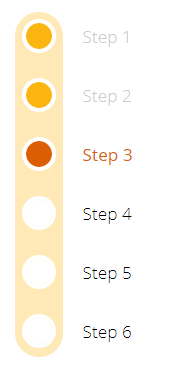
Example
Here is how your progress bar can look:
Notes
Why ActiveStep and SelectedStep?
Separating the current active step from the selected step when a user clicks on a step allows you to put some code in-between. Meaning, when a user clicks on a step, you can do some checks before you actually set that step as active.
To do so, just add a hidden toggle on your screen, set its Default property to the OnSelect output property from the component and in the OnCheck event of the toggle put your code to do the checks you want. Then at the end of your code, set a variable to change the ActiveStep of the progress bar to the SelectedStep value.
History
- 20-feb-2020: first release