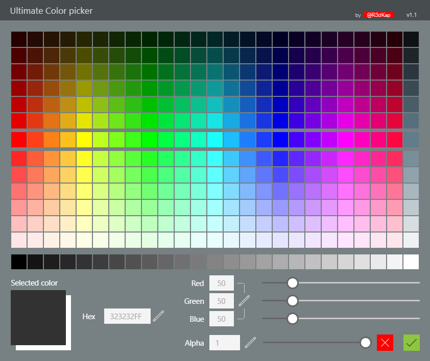
UltimateColorPicker component
This color picker component will automatically calculate a palette of light and dark shades based on a list of main colors you will provide.

How to use it
Please follow these instructions:
- Insert the component on a screen in your app
- Set the list of main colors in the MainColors input parameter of the component (check out the default sample values)
- If needed, set the default selected color value using the DefaultColor input parameter (use format #rrggbbaa)
- Customize the size of the squares and their padding using the ColorSquareSize and ColorSquaresPadding input parameters
- DO NOT RESIZE the component manually; it’s automatic
- Once the user has chosen his color, check out the SelectedButton output parameter to see if he pressed OK or CANCEL
- Chosen color is in one of the output color parameters (see below)
Features
Here is the list of features provided with this color picker:
- Customizable title
- Set title’s visibility
- Set author’s link visibility
- Set component’s version number label visibility
- Customizable main colors (center row in the palette)
- Automatic light and dark shades palette based on main colors
- Greyscales dedicated shades palette
- Customizable color square size and padding between squares
- Customizable selected color background (usefull when alpha < 1)
- Active color in color picker palette is pin-pointed by a bullet point
- Selected color can be set in Hex mode or in RGB mode
- RGB color and alpha values can be set using sliders or with the keyboard
- Output of selected color in multiple formats: Power Apps color, Hex, RGBA separated values, “RGBA(r,g,b,a)” string
- COMING SOON - Customizable number of shades for the palette
- COMING SOON - Responsive component
Properties
Here are the properties available to configure the color picker:
Input
- DefaultColor (color) = default selected color (in the form #rrggbb)
- Title (string) = title for the component
- TitleColor (color) = text color for the component’s title and version number
- HideAuthor (boolean) = hides the author displayed in the component’s title bar
- HideVersion (boolean) = hides the version number displayed in the component’s title bar
- ShowTitle (boolean) = shows or hides the component’s title
- MainColors (table) = main colors list in the form: Table({Value: “#rrggbb”},{Value: “#rrggbb”},…)
- ShadesCount (number) = number of shades in the palette (COMING SOON)
- ColorSquareSize (number) = size, in pixels, for the palette color squares
- ColorSquaresPadding (number) = padding between the palette color squares
- SelectedColorBg (color) = color for the background behind the selected color square
Output
- SelectedColor (color) = picked color value in Power Apps color format
- Red (number) = red value for the picked color
- Green (number) = green value for the picked color
- Blue (number) = blue value for the picked color
- SelectedAlpha (number) = alpha value for the picked color
- SelectedRGB (string) = picked color in RGBA string format: RGBA(<r>,<g>,<b>,<a>,)
- SelectedHex (string) = picked color in Hex format: #rrggbbaa
- SelectedButton (string) = button clicked (value can be: OK or CANCEL)
- ReservedWidth (number) = RESERVED FOR INTERNAL USE ONLY
- ReservedHeight (number) = RESERVED FOR INTERNAL USE ONLY
HISTORY changes
v1.0 [ 29-nov-2019 ]
- Initial publish
v1.1 [ 01-dec-2019 ]
- Added greyscale palette
- Fixed component auto-size
- Fixed positionning of some controls
- Grouped controls inside containers
- Prefixed hex output with “#”
- Added TitleColor input parameter to set component’s title bar text color
- Added author link + HideAuthor input parameter to hide author
- Added version label + HideVersion input parameter to hide version number