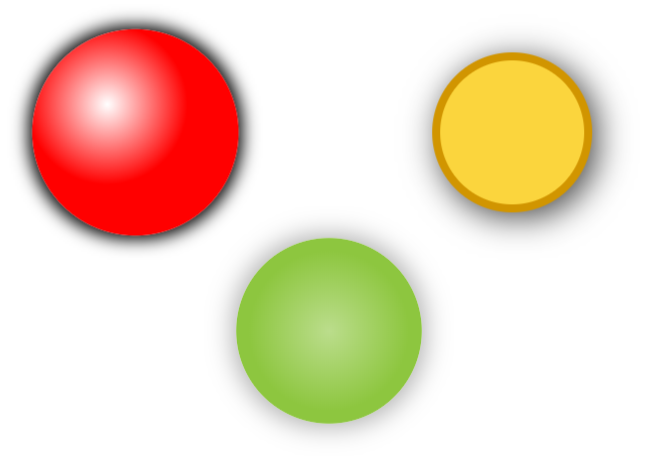
ShadowCircle component
This component allows you to create a circle with a drop shadow and an inner solid or gradient fill color.
Notes
Please note that the radius of the circle cannot be set manually through a parameter but is automatically calculated by the component according the shadow parameters: shadow offset, shadow blur and shadow radius.
Properties
Here are the properties available to configure the circle:
Input
- SolidFill (string) = fill color for the circle (color can be: color name, #rrggbb or rgb(rr,gg,bb))
- FillOpacity (number) = value between 0 and 1 to specify the circle fill color opacity (0 is transparent, 1 is opaque)
- ShadowOffsetX (number) = horizontal position of the shadow (positive: to the right; negative: to the left)
- ShadowOffsetY (number) = vertical position of the shadow (positive: to the bottom; negative: to the top)
- ShadowRadius (number) = radius in pixels for the circle’s shadow
- ShadowBlur (number) = integer value to specify how much the shadow should be blurred
- ShadowColor (string) = color for the shadow (color can be: color name, #rrggbb or rgb(rr,gg,bb))
- ShadowOpacity (number) = value between 0 and 1 to specify the shadow opacity (0 is transparent, 1 is opaque)
- CircleBorderWidth (number) = thickness for the circle’s border
- CircleBorderColor (string) = color for the circle’s border (color can be: color name, #rrggbb or rgb(rr,gg,bb))
- GradientFill (boolean) = activates a gradient fill for the circle
- GradientX (number) = X position of the gradient’s center
- GradientY (number) = Y position of the gradient’s center
- GradientRadius (number) = radius in pixels for the gradient
- GradientStartColor (string) = starting color for the gradient (center) (color can be: color name, #rrggbb or rgb(rr,gg,bb))
- GradientEndColor (string) = ending color for the gradient (edges) (color can be: color name, #rrggbb or rgb(rr,gg,bb))
- GradientStartColorOpacity (number) = value between 0 and 1 to specify the gradient’s starting color opacity (0 is transparent, 1 is opaque)
- GradientEndColorOpacity (number) = value between 0 and 1 to specify the gradient’s ending color opacity (0 is transparent, 1 is opaque)
- Debug (boolean) = activates debug mode for the component -> displays some information about calculated values inside the component
Output
- MarginX (number) = distance between the left/right border of the component and the circle’s edge (border’s thickness is not considered)
- MarginY (number) = distance between the top/bottom border of the component and the circle’s edge (border’s thickness is not considered)
- Radius (number) = circle’s radius in pixels (calculated by the component)
Examples
Using all these properties you can create various circles with their drop shadows and gradient fill color:

HISTORY changes
v1.0 [ 30-dec-2019 ]
- Initial publish