ProgressBar component
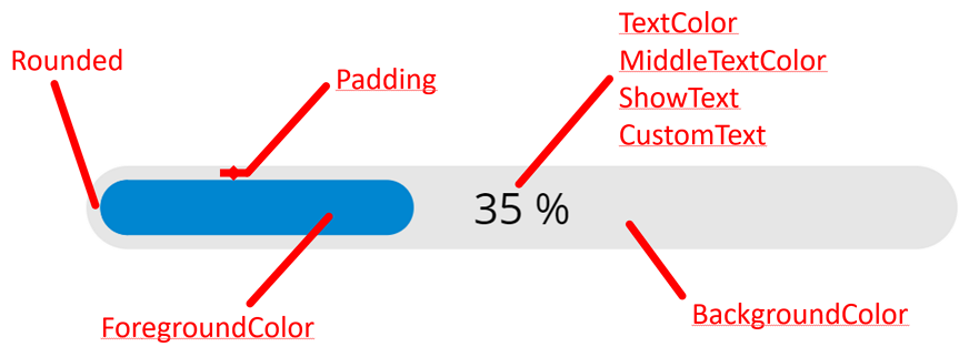
This component alows you to add a linear horizontal progress bar to your Power Apps canvas applications. Many properties allow you to customize the progress bar to your needs:

Properties
Here are the properties available to configure the progress bar:
Input
- MaxValue (number) = maximum value of the progress bar
- Value (number) = current value of the progress bar
- Percentage (boolean) = if True, shows a percentage value in the middle of the progress bar, else shows XXX / YYY (XXX being the current value and YYY the max value)
- CustomText (text) = a text replacing the percentage or the XXX / YYY label shown in the center of the progress bar
- Rounded (boolean) = if True, renders a progress bar with rounded edges, otherwise the progress bar is rectangular
- Padding (number) = number of pixels between the background and the progress bar itself
- BackgroundColor (color) = color for the background of the progress bar
- ForegroundColor (color) = color for the progress bar itself
- TextColor (color) = color for the label at the center of the progress bar showing the percentage, the XXX / YYY or the custom text
- MiddleTextColor (color) = color of that label once the value of the progress bar has reached half of its max value
- Size (number) = font size for the label shown at the center of the progress bar
- ShowText (boolean) = shows or hide the label shown at the center of the progress bar
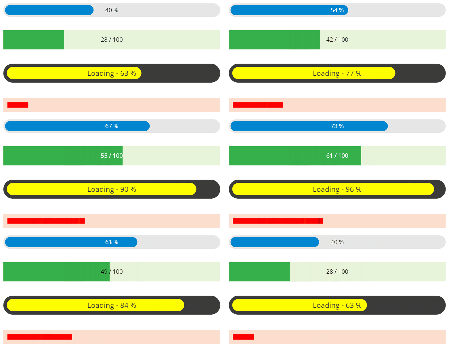
Examples
Using all these properties can allow you to add progress bars with various looks to your applications…

HISTORY changes
v1.0 [ 26-aug-2021 ]
- Initial publish