CircleProgressBar component
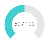
This component is a configurable circle progress bar.
Component properties
Here are the properties available to configure the progress bar:
Input
- Max (number) = maximum value (default is 100)
- Value (number) = actual progress value (default is 50)
- ShowLabel (boolean) = shows/hides the label in the center (default is True)
- LabelSize (number) = font size for the label in the center (default is 20)
- BarBgR, BarBgG, BarBgB (numbers) = red, green and blue components for the color of the background progress circle (the grey one on the capture above)
- BarR, BarG, BarB (numbers) = red, green and blue components for the color of the actual progress circle (the cyan one on the capture above)
- BarBgWidth (number) = width for the background progress circle
- BarWidth (number) = width for the actual progress circle
- LineCapRound (boolean) = if True, the line cap for drawing the circles is ‘round’, otherwise it’s ‘square’ (default is True)
- ValueMode (text) = how to display the value within the circle: X/Y or as a percentage value (use the ValueModeEnum output property as an enumeration to set the value)
- PercentageDecimals (number) = determines how many decimals are shown for the percentage value (only applicable if ValueMode is set to ValueModeEnum.Percentage)
Output
- ValueModeEnum (record) = use this enumeration to set the value of the ValueMode property (MaxValue shows the value as X/Y; Percentage shows the value as a percentage value, using the PercentageDecimals property to set how many decimals should be displayed)
Examples
Set the LineCapRound property of the component to False if you want your progress bar look like this:

Updates
- 20-may-2019: fixed the ShowLabel property that was not effective + added new LineCapRound property
- 11-may-2020: added the ValueMode, PercentageDecimals and ValueModeEnum properties to allow different display modes for the value
- 03-may-2022: fixed division-by-zero error message showing up from time to times